Histogram processing in Coffea
While coffea provides its own `coffea.hist <https://coffeateam.github.io/coffea/api/coffea.hist.Hist.html>`__ package, to better interface with the python ecosystem in general, I recommend users to start their analysis using the `scikit hist <https://hist.readthedocs.io/en/latest/?badge=latest>`__ package, as it is more general purpose, and coffea histogram will be depreciated in newer version of coffea. All the core functionalities would be the same, but sckikit hist (which
we will refer to as just hist for the remainder of this tutorial) has more bells and whistles out of the box. A very good documentation on using hist is already provided by the developers here, so this documentation would mainly focus on going over the fundamental concepts of using histogram for physics analysis.
One thing that will not be included in this documentation would be the plotting of histogram, as there are much too many customization options to go over. Here we will be using the in-built Hist.plot1d and Hist.plot2d with minimal styling settings, just to illustrate how the data in the histogram are being stored.
Let us start by importing the basic libraries that we will be using: hist and numpy (numpy would mainly be used for pseudo-data generation and nothing else.)
[30]:
import hist
import numpy as np
import matplotlib.pyplot as plt
Histogram construction in computation
Histograms in the context of an analysis is typically used to tally the number of entities that fall under some “discrete” criteria. These criteria can either be some true discrete variable (like data sets/particle flavor), or some continuous variable that we explicitly discrete-ize (like for particle kinematic variables). Let use make a very simple histogram that represents the 3 particle kinematic variables used in HEP: \(p_{T}\), \(\eta\) and \(\phi\):
The filling of the histogram can be done in parallel, supposing that you have arrays of identical dimensions.
[14]:
h = hist.Hist(hist.axis.Regular(100, 20, 100, name='pt'),
              hist.axis.Regular(100, -3, 3, name='eta'),
              hist.axis.Regular(100, -np.pi, np.pi, name='phi'))

N = 10_000_000
pt = np.random.exponential(50, size=N)
eta = np.random.normal(size=N)
phi = np.random.uniform(-np.pi, np.pi, size=N)
h.fill(pt=pt, eta=eta, phi=phi)
[14]:
Regular(100, -3, 3, name='eta', label='eta')
Regular(100, -3.14159, 3.14159, name='phi', label='phi')
Double() Σ=5334785.0 (10000000.0 with flow)
For a computer, a histogram is just an array of values, indicating the number of entries that was filling in “bin”. Formally, the hist package uses what is known as the “unified histogram interface notation” (UHI), so the following
[15]:
h[0, 50, 15]
[15]:
20.0
Simply indicates the histogram value stored in the 0-th bin of the \(p_T\)-axis, the 50-th bin of the \(\eta\)-axis, and the 15-th bin of the \(\phi\) axis.
As working with raw bin indices is rather cumbersome, the UHI notation allows the use of j as a postfix to indicate that one want the bin that contains some numerical value, for instance:
[17]:
h[25j, 0.5j, -1.2j]
[17]:
26.0
Would indicate the histogram value of the bin that contains \(p_{T}\) value 25, \(\eta\) value 0.5 and \(\phi\) of value -1.2.
Here we are treating the histogram as an array, knowing that the first index corresponds to the \(p_{T}\) UHI bin index, the second corresponding to the \(\eta\) UHI bin index and so on. As long as one has declared the histogram axis with a name, a dictionary can also be used to explicitly specify the bin index for some named axis, rather than having to keep track of the axis ordering manually. For example the two expressions below
[18]:
print(h[25j, 0.5j, -1.2j])
print(h[{'phi': -1.2j, 'pt': 25j, 'eta': 0.5j}])
26.0
26.0
Means entirely the same UHI index, just one is much more human friendly with more explicitly notations of which bins are being requested without needed to tracking the axis ordering.
Histogram slicing and truncation
Very rarely will we need to operate directly on raw histogram values. Most of the time, the rationale for using a high dimensional histogram like this would be that we can consider the most general distribution among all variables of interest, and retroactively zoom in on some region of phase space of interest. That is where the real power of thinking of histograms as arrays comes in: the same notation used to perform array slicing in numpy can be used here for histograms as well. Supposed
we are only interested in the case where \(\phi\) of the particle lies in the same bin as some value (may that specific region of the detector is faulty), what we can so would be something like:
[22]:
h2d = h[:, :, 1j]  # or h2d = h[{'phi': 1j}]
h2d
[22]:
Regular(100, -3, 3, name='eta', label='eta')
Double() Σ=53118.0 (100110.0 with flow)
Now we can see, that simply by specifying only 1 bin for a particular axis, we have now reduced our histogram to just 2 dimensions! If you think of the full 3D histogram as a representation of a function in discrete input values
The notation is effectively saying we want to create a new 2D function/histogram by fixing the value of \(\phi\):
Another common operation would be that we retroactively decided that we are not interested in the \(\phi\) distribution of the particles (it might be uninteresting or irrelevant), in which case we would like to “project out” or integrate out the distribution on a certain axis. In this case, one can use the notation:
[23]:
h2d = h[:, :, sum]  # or h2d = h[{'phi':sum}]
h2d
[23]:
Regular(100, -3, 3, name='eta', label='eta')
Double() Σ=5334785.0 (10000000.0 with flow)
In the analogy of function reduction, it is similar to an integration (or in this case, a summation) over the possible values in one of the axis:
As a sanity check, one can see the histogram that has integrated over the \(\phi\) bins contain many more entries than that where we are “slicing” a particular \(\phi\) bin.
Slicing can also work to zoom in on a region of the histogram. Say for example we are only interested in the particles in the positive forward region, we can write something like:
[24]:
h_forward = h2d[:, 1.5j:3.0j]  # or h_forward = h2d[{'eta':slice(1.5j,3.0j)}]
h_forward
[24]:
Regular(25, 1.5, 3, name='eta', label='eta')
Double() Σ=350324.0 (10000000.0 with flow)
We can now see that the \(\eta\) range has been shifted to contain just the entries from \(\eta \in [1.5,3.0]\) rather than the original \(\eta\in [-3.0,3.0]\) range. One might think that now we can compare the particle \(p_{T}\) distribution of jets in the positive forward region and the central region by combining slicing and integration:
[32]:
p_forward = h2d[{'eta': slice(1.5j, 3.0j)}][{'eta': sum}]
p_central = h2d[{'eta': slice(0j, 1.5j)}][{'eta': sum}]

fig, ax = plt.subplots(figsize=(6, 4))

p_forward.plot1d(ax=ax, label='forward')
p_central.plot1d(ax=ax, label='central')
ax.legend()
[32]:
<matplotlib.legend.Legend at 0x7fe6d7bc2310>
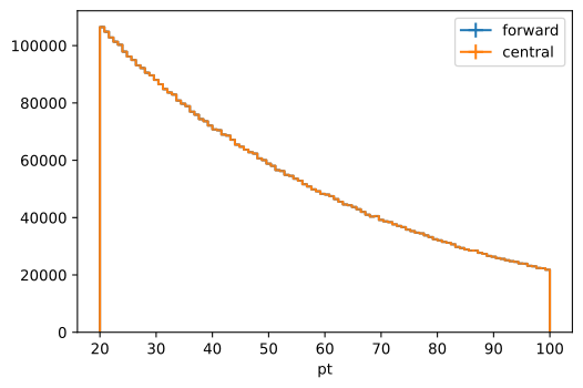
But strangely, this gives us two identical histograms. The reason for this is that the histogram integration via the sum indicator sums over all bins on the axis, including the overflow and underflow bins. After histogram slices, entries are not so much removed, but rather they are merged to the underflow and overflow bins of the new axis. One can check this simply by seeing that the p_forward and p_central histograms declared above has the same number of entries when considering all
entries including the flow bins.
[38]:
print(p_forward.__repr__())
print(p_central.__repr__())
Hist(Regular(100, 20, 100, name='pt', label='pt'), storage=Double()) # Sum: 350324.0 (5000980.0 with flow)
Hist(Regular(100, 20, 100, name='pt', label='pt'), storage=Double()) # Sum: 2319945.0 (6970601.0 with flow)
To integrate over a range, we will need to explicitly set the overflow and underflow bin to zero. As the histogram value modification looks very much like array value manipulation, the function to perform the integration should look something like this:
[41]:
def int_range(h, axis_name, int_slice):
  h_slice = h[{axis_name: int_slice}]
  # This needs to be an array! Since the overbin slicing still gives you and
  # array!
  h_slice[{
    axis_name: hist.overflow
  }] = np.zeros_like(h_slice[{
    axis_name: hist.overflow
  }])
  h_slice[{
    axis_name: hist.underflow
  }] = np.zeros_like(h_slice[{
    axis_name: hist.underflow
  }])
  return h_slice[{axis_name: sum}]


p_forward = int_range(h2d, 'eta', slice(1.5j, 3.0j))
p_central = int_range(h2d, 'eta', slice(0j, 1.5j))
fig, ax = plt.subplots(figsize=(6, 4))

p_forward.plot1d(ax=ax, label='forward')
p_central.plot1d(ax=ax, label='central')
ax.legend()
[41]:
<matplotlib.legend.Legend at 0x7fe6d55c4220>
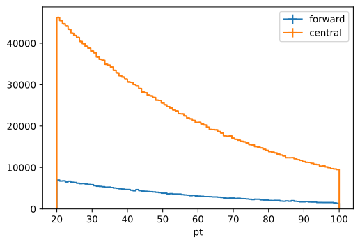
Also notice how the axis underflow and overflow bins need to be accessed via a special index value hist.underflow and hist.overflow. This is to save more on the issue of whether the bin indices to break the computation convention of starting at 0 to account for the underflow bins, as it does with ROOT.
More axis types
Previously all, of our examples are done with the simple axis types of having regular interval binning. Here let us familiarize ourselves with the other axis types, and how these can also be used for the UHI notations:
[43]:
hist.axis.Variable
[43]:
hist.axis.Variable
The user provides the binning scheme \({x_i}\) in array format to be used for a continuous variable, a slight word on how the slicing using the j postfix interacts with the bin edges. For the slice request of \(Aj\), the histogram will find bin index \(B\) such that \(A \in [x_B, x_{B+1})\). Notice the boundary of the values in question.
[ ]:
hist.axis.StrCategory
The categorical axis. Notice that by default, the user should provide a list of categories that the histogram should attempt to classify, and entries that do not match the provided list will be placed in the overflow bin. If you want the histogram to dynamically generate the categories on filling, declare with axis with the growth=True options. For value-based-slicing, the user can simply provide a single string or a list of string of the categories of interest. Such as
h[{'cat': 'A'}] # The cat axis is discarded as we are looking a since bin entry
h[{'cat': ['A', 'B']}] # The cat axis is kept, with just 2 valid entries  remaining.
More fill types
Commonly in HEP analysis, we will need to construct histogram with weighted entries. So do this, you will need to explicitly specify the storage of the histogram to anticipate weights:
[52]:
h = hist.Hist(hist.axis.Regular(50, -5, 5, name='x'),
              storage=hist.storage.Weight())
h.fill(x=np.random.normal(scale=2, size=1_000_000),
       weight=np.random.normal(loc=0.1, scale=0.01, size=1_000_000))
[52]:
Weight() Σ=WeightedSum(value=98773.4, variance=9977.51) (WeightedSum(value=100013, variance=10102.5) with flow)
Now when you slice to a single bin value, you will notice that the return is weight container:
[48]:
h[{'x': 5}]
[48]:
WeightedSum(value=609.873, variance=61.6699)
The values correspond to the sum of weight \(sum_i w_i\) and the sum of weights squared \(sum_i w_i^2\) for that specified bin entry. You can access each element using the usual index notation:
[51]:
print(h[{'x': 5}])
print(h[{'x': 5}]['value'])
print(h[{'x': 5}]['variance'])
WeightedSum(value=609.873, variance=61.6699)
609.8726791968885
61.669854926889464